


Design Tricks That Make You Reach for One Drink Over Another

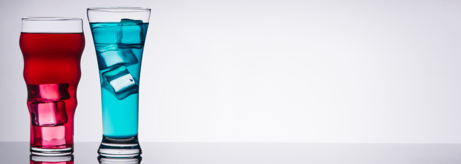
Table Of Contents
Walk into any grocery store and head to the drink section. There are rows and rows of cans. Some are bright. Some are shiny. Others have bold fonts or strange names. Even before tasting anything, it’s easy to feel drawn to one can more than another. That’s not by accident.
The way a drink looks on the outside actually plays a huge part in what people choose to buy. Companies spend time and money making sure their cans look cool, different, or even weird—just so they’ll grab attention. And one of the biggest tools they use is custom printing.
Why the Outside Matters So Much
Most people pick what they’re going to drink in a few seconds. That means there’s not a lot of time to explain what makes one drink better than the next. So companies use design to do that for them.
The colors, text, and even texture of the can can make someone stop, look closer, and decide to try it. It’s almost like the design talks before the drink gets a chance to.
Printed cans help make that first impression a strong one. Instead of sticking a label on a blank can, the design is printed directly onto the can’s surface. That way, it looks smoother, feels cleaner, and just stands out more. For brands trying to make a splash or show off something new, finding high-quality printed cans is one of the best steps to take.
Colors That Catch the Eye
One of the first things people notice is color. Bright colors feel fun or exciting. Dark colors feel more serious or strong. Some colors, like blue and green, can even make a drink seem cooler or more refreshing.
Drink brands use color to send a message fast. A bright red can might say “this is bold,” while a pastel pink one might say “this is soft and sweet.” Even if the drinks are similar, their packaging can totally change how they’re seen.
Colors can also help drinks stand out next to others. If a shelf is filled with silver and white cans, a dark purple one will immediately catch someone’s eye. That extra second of attention can be all it takes to make a sale.
Fonts That Speak Without Words
Font might not seem like a big deal, but it actually changes how people feel about a product. Thick, blocky letters can feel strong. Thin, cursive fonts feel fancy or gentle. A drink for kids might use bubbly letters, while an energy drink might go with sharp, slanted text that feels fast.
Fonts tell people what to expect without them even realizing it. That’s why drink companies test tons of styles before choosing one. The font isn’t just there to give the name—it’s part of the whole mood.
And with printed cans, fonts can be built into the whole design. They don’t sit on top like stickers. Instead, they’re part of the actual artwork, which makes everything look cleaner and more polished.
Pictures, Patterns, and Personality
Some drinks use pictures on their cans to tell a story. That might be a cartoon fruit, a mountain scene, or even a robot. These images make the can feel alive. They also help it feel more personal, especially for younger buyers who are into creative, fun designs.
Patterns are another big trick. A repeating swirl or zigzag can make a can look modern. A simple stripe can make it feel classic. These small touches add to how the can feels and what it says about the drink.
All of these elements—colors, fonts, pictures, patterns—come together to give the can personality. And that personality often matches the person the drink is meant for. Teens might go for wild designs. Adults might go for clean and classy. Each can is built to connect with someone.
The Feel of the Can Also Counts
This might be a surprise, but how a can feels matters too. Some printed cans have a soft-touch finish, which makes them feel smooth or even velvety. Others are matte instead of shiny, which gives a more natural vibe.
People notice this stuff, even if they don’t think about it much. A smooth-feeling can might feel premium or high-quality. A textured one might feel unique or handcrafted. The feel adds one more layer to how the drink is judged before it’s even opened.
Why Printed Cans Are Better Than Labels
Some drinks use regular cans and just stick labels on them. That works, but it doesn’t always look great. Labels can peel, wrinkle, or fade. They also make the can look cheaper, even if the drink inside is good.
Printed cans avoid all that. The design is baked into the metal, so it lasts longer and looks sharper. Plus, printed cans can go edge to edge with artwork, which gives designers more space to get creative.
For drink brands, this means more freedom to make cool, bold designs that connect with buyers. It’s not just about holding liquid—it’s about showing what the brand stands for. And for stores or vending machines packed with options, that extra bit of polish can make a big difference.
Design Helps Build Trust Too
When a can looks well-made, people are more likely to trust the drink inside. A clean, professional design says the brand cares about quality. If the outside looks good, it makes people think the inside will be good too.
This is really important for new brands that nobody has heard of yet. Since people can’t know what it tastes like, they go off what they can see. A smart design helps earn that first sale—and if the drink is good, people will come back for more.
It’s Not Just About Looks
Even though design plays a huge role, it still has to match what the drink actually is. If the design says “super sweet strawberry,” but the drink tastes bitter, people won’t be happy. The best designs are honest about what to expect.
So when brands choose colors, fonts, or images, they try to match the flavor and feel of the drink. That way, everything lines up and makes sense together. Good design isn’t fake—it’s just the best version of the truth.
What to Remember Next Time You Grab a Drink
Next time you’re standing in front of a shelf full of drinks, think about what pulls your attention. Is it the bold color? The cool font? Maybe a funny drawing or shiny finish? Whatever it is, that’s design doing its job.
The way a can looks plays a big part in what ends up in someone’s hand. Printed cans let brands get creative and send the right message in seconds. They’re not just for holding soda—they’re part of the drink’s story. And when that story looks good, people are more likely to buy in.